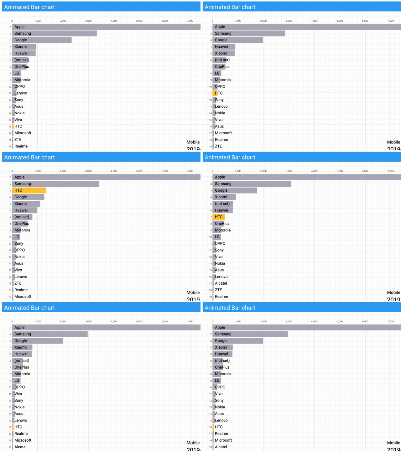
I’m pleased to share a new Data Studio community visualization, called Animated Bar Charts. As the name suggests, it allows you to create a Top 10 List type bar chart and animate it over time.
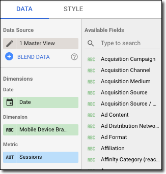
The visualization is built with D3. With Data Studio you can quickly and easily try the visualization with different data. D3 visualizations are often hand-built for a specific dataset, which typically has to be read in as a csv file from a web server. Data Studio takes care of the data loading as you just connect to any data source that Data Studio offers, whether it’s Google Analytics or Google Sheets. You just need a Date, a dimension and a metric you’re interested in. Data Studio helps you out by showing you the fields you can use in the configuration panel:

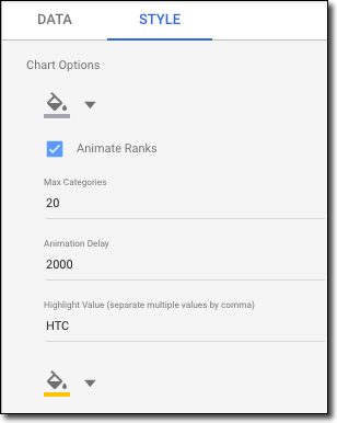
Customize the appearance of the chart and pick your own colors. You can even highlight specific data points to draw the viewer’s attention.

To use visualization in your own reports please check out this data studio report for instructions. Let me know if you use the visualization in any interesting ways or if you have suggestions for improvement.

